| == The Project == This was an extra assignment that I completed with the time I had left in drawing class. I wasn’t following a specific curriculum, I was simply practicing movement, overlapping, and contrast while trying to eminate the emotional minimalistic style of illustrator Peony Yip. == My Process == Before I started on this art project I had to take pictures of my hands in various unnatural positions and then arrange sketches of them on the paper so that there was balance and movement in the piece. Then I had to pick my light source (upper right) and shade the hands accordingly with attention to shadows. The steps in making this work of art that were most important to me were making sure the hands were proportionate and that the string allowed for movement between the hands. I also wanted to achieve high contrast by outlining the hands, giving it a conflicting 2D-3D effect that I think works well in the piece. One part of the process that was a little difficult for me was the color. I felt that the black/white/red was a bit too flat, but I didn’t want to add a flesh tone to the hands. Instead, I added a slight pale green to the background inside the frame to contrast with the red string. | 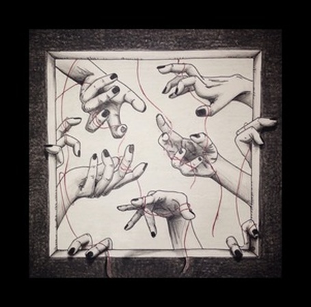 "Weave"== The Theme == My drawing is another study on hands. I wanted to explore more “creepy” positions that I could contort my hands into and practice movement and balance. I think this composition is much more disturbing than the other hand drawing I did and I think it is a much more successful piece. I stuck with minimal color and a darkened scheme to add to the creep factor. I was trying to reflect the works of Hong Kong based illustrator Peony Yip, who focuses on minimalistic designs with hauntingly whimsical elements. == Conclusion == I enjoyed doing this project because I liked the “dark” elements of it. I also was very happy to practice drawing hands again. I can definitely improve on my shading with respect to light source and my use of color. I also think that the drawing could have benefitted from a lot more overlapping. |
|
0 Comments
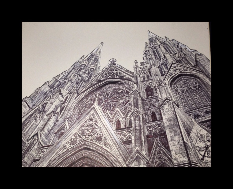 "St. Patrick's Cathedral"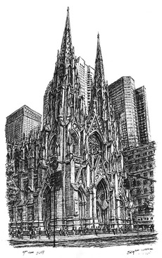 == The Project ==
The assignment for this project was to create a composition using only a single pen and draw until it had run out of ink. The subject matter was entirely open so I chose a picture of St. Patrick’s Cathedral in New York City. == My Process == Before I started on this art project I had to think about the angles of the architecture of the picture I was working with. I sketched out angle lines and a rough outline of some of the architecture. Then I had to begin adding value and details to the piece, working continuously on the whole instead of focusing on one specific area at a time. This was to conserve ink and not run out at the end. The steps in making this work of art that were most important to me were remaining accurate to the picture while also not running out of ink. One part of the process that was a little difficult for me was the amount of detail I had to put in to do the cathedral justice. == The Theme == My drawing is trying to communicate the beauty and majesty of the cathedral. I visited it in the fall last year while it was under reconstruction. Though parts were covered in scaffolding, it was still incredibly breathtaking and I immediately fell in love with the architecture. I was also trying to emanate the style of Stephen Wiltshire (pictured to the left). Wiltshire draws detailed cityscapes entirely from memory. He uses ink and paper for nearly every drawing. == Conclusion == I enjoyed doing this project because it forced me to focus on details of the bigger picture and not just specific areas (if that makes any sense?). It was a fun challenge and I was semi-pleased with how it turned out. I want to improve on being careful with how much ink I have left. I actually had to remove the background from the original paper because I tried to finish it with too little of ink left in the pen and it looked terrible.
== The Theme ==
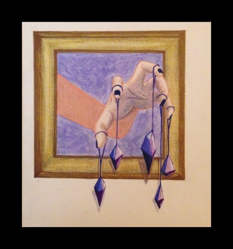
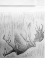
My drawing doesn’t particularly represent anything. I simply wanted to practice drawing hands and crystals and so I created a composition that allowed for that. I’m pleased with how it turned out, but I didn’t particularly have any specific meaning in mind when I drew it. I suppose I meant for it to be “beautifully creepy” because the position of the hand is awkward and unnatural but the crystals are rather attractive and striking.
== The Theme ==
|
| == The Project == The assignment for this project was to use India ink to create a two point perspective drawing. The drawing must include an “impossible monument” that is physically too big to be built and/or too expensive to be built. The drawing could also be an abstract building//monument composition. == My Process == Before I started on this art project I had to practice two point perspective as well as practice with the India ink and nibs. Then I had to come up with two rough sketches to be used as possible ideas for my final. The steps in making this work of art that were most important to me were making sure that if I dripped or messed up the India ink in any way, it could be worked into the piece. I also wanted to be careful with maintaining the two point perspective. One part of the process that was a little difficult for me was creating the window smudges because I was doing it with an opaque ruler. I couldn't see how the ink was smudging; it was truly a “hit-or-miss” situation. | 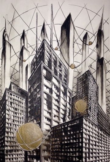 "Unattainable" |
== The Theme ==
My drawing has a bit of a back story that helped me to communicate my intention of the piece. The picture is set in a post-apocalyptic world. The poverty ridden lower class swarms around on the ground like rats. The middle and upper classes live in the buildings, wealth increasing with floors. Because the world is full of smog, grime, and no power, the wealthy have built giant orbs of pure gold that reflect light throughout the city during the daytime. However, it is a horrid thing because the poor must always look up at the gold that they can never have.
== Conclusion ==
I very much enjoyed doing this project. It was fun and challenging to work with India ink and I always have a soft spot for city-scapes. I want to improve on my multi-point perspective skills as well as my inking skills. I think the drawing could have been more effective if I had been more proficient in those skills.
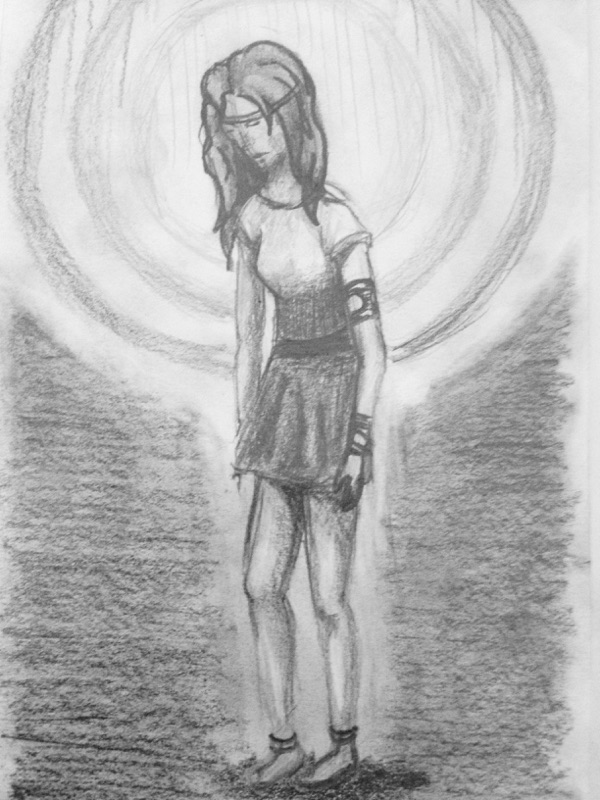
| == The Project == The assignment for this project was to create an original composition without using any photos or reference pictures and use oil pastels as the main medium for creating the piece. == My Process == Before I started on this art project I had to figure out a design that I liked. I created three designs and chose my favourite. Then I had to transfer my initial sketch onto pastel paper and use oil pastels to create the piece The steps in making this work of art that were most important to me were that I try to keep everything clean and neat and that the black background not blur into the figure of the girl. One part of the process that was a little difficult for me was creating detail with the large, messy oil pastels. It is an obstacle that I was unable to overcome. == The Theme == My drawing vaguely represents the purity of nature and how it is being destroyed. The girl is being shot at with arrows and dismembered such as humanity continues with deforestation and illegal hunting and trapping. Her skin and hair colors are unnatural because she is not tied to the grime and impurity of humanity. | 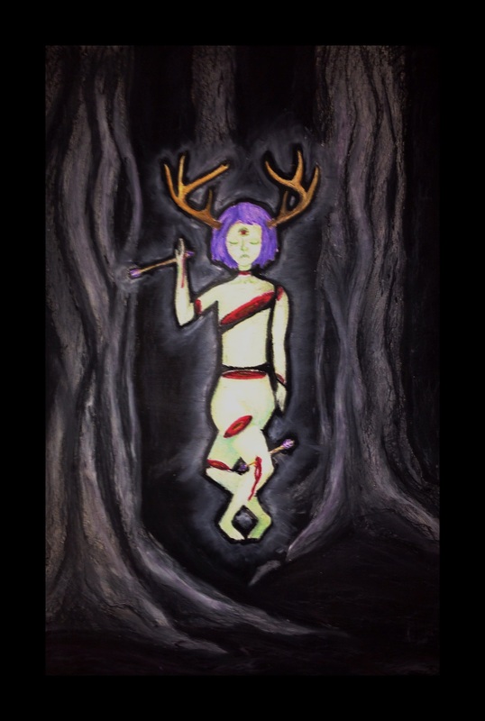 "Silent In the Trees" |
== Conclusion ==
I did not particularly enjoy doing this project. I find oil pastels to be hard to work with and very messy. For someone who enjoys putting a lot of detail into my work it was hard to fine tune certain aspects and over all very frustrating. I want to improve on my detail work with oil pastels. I think perhaps purchasing a set with smaller tips to work with would be beneficial.
I did not particularly enjoy doing this project. I find oil pastels to be hard to work with and very messy. For someone who enjoys putting a lot of detail into my work it was hard to fine tune certain aspects and over all very frustrating. I want to improve on my detail work with oil pastels. I think perhaps purchasing a set with smaller tips to work with would be beneficial.
| The purpose of this worksheet was to practice blending, shading, and well, coloring with colored pencils. The Elements that this practice sheet involved were color, value, and form. | 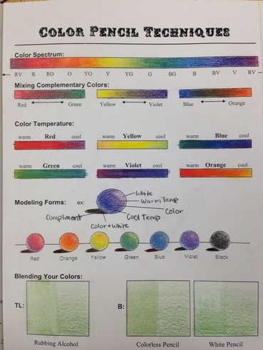 |
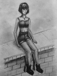
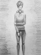
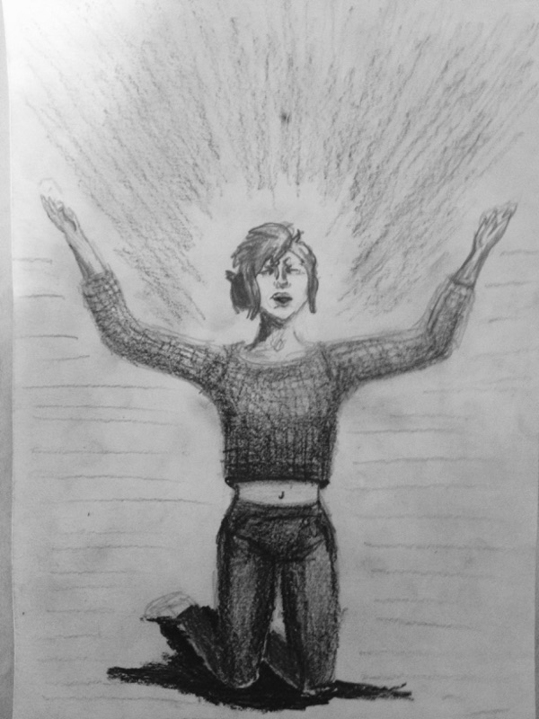
| // The Project // The assignment was to first draw the mannequins in five different positions. Then, in a secondary drawing, add a character to the mannequin. The goal was to focus on dimension, perspective, proportion, and contrast. It definitely made me think about proportions of human anatomy. // My Process // Before I started on this art project I had to sketch the basic framework of the human body in the position that I had chosen. Then I had to build off of that “skeleton” to create a form that followed the pose I had decided upon. Later I repeated the process and added an actual character to the mannequin. The steps in making this work of art that were most important to me were that the proportions were correct and there was a high amount of contrast. One part of the process that was a little difficult for me was creating high contrast textures. I found it challenging to create such detail on the paper I was using as well as with the various pencils. // The Theme // This collection of drawings has an overall melancholy tone. Most of the poses I have chosen for the girls emanate a sadness or angst. //Conclusion // I enjoyed doing this project because it helped me to practice proportion in respect to the human anatomy. I also liked that I had the chance to create a collection of slightly unified drawings. Finally, I loved that I was allowed to create drawings with high contrast. I want to improve on proportion, cast shadows of human figures, and defining textures. | "Melancholy Girls"
|
Author
Write something about yourself. No need to be fancy, just an overview.
Archives
May 2015
April 2015
January 2015
 RSS Feed
