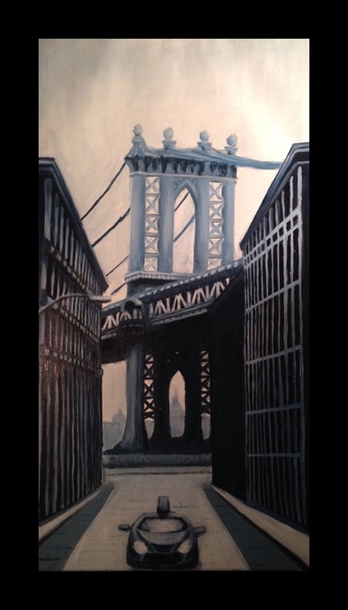
BROOKLYN LINEAR PERSPECTIVE
|
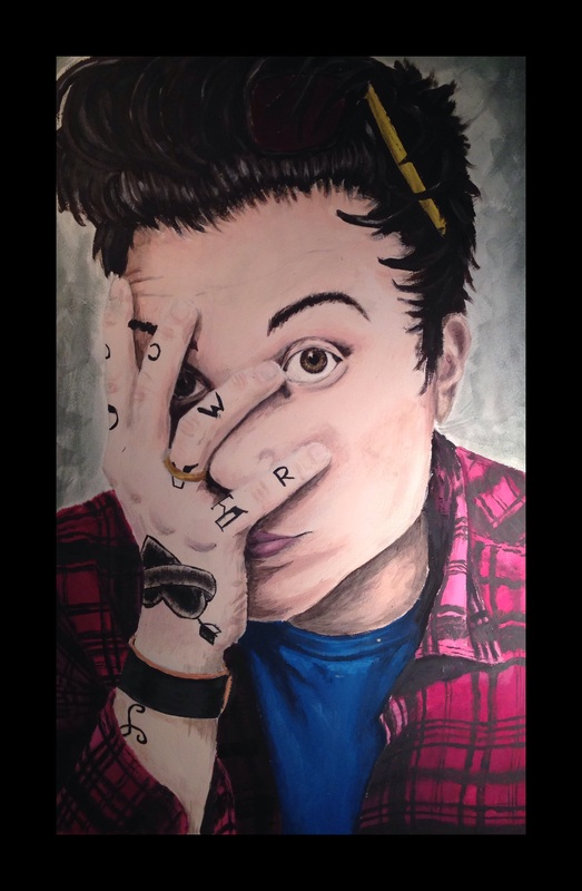
FRNKIERO FINAL PAINTING
MEDIUM - ACRYLIC & WATERCOLOR ON WATERCOLOR PAPER. COLOR SCHEME: REALISTIC |
CRITIQUE OF FRNKIERO FINAL PAINTING
- Artist's name: Carly Stults
- Title of work: frnkiero
- Type of artwork: Acrylic and Watercolor on Watercolor Paper.
- Subject of the painting: Portrait of Frank Iero
- First impression: Yellow Sun glass side, high contrast in shirt, contrast of tattoos.
- Colors: Predominantly reddish & warm colors with slight amounts of cool colors thrown in for contrast.
- Shapes, lines and texture: Plaid shirt shows texture, lines of hair give body and shape.
- Sensory qualities: Overall mischievous mood (?) yet looks slightly exhausted.
- Shadows & Light: There is a high contrast in the photo, which translates to many distinct shadows and highlights to show depth.
- Shape and Form: The organic shapes of the face and hair contrast nicely with the geometric qualities of the plaid shirt and sunglasses.
- Criticism: Could have done better with the skin tones and color of shadows, hair is very stringy, could have chosen a more interesting background, sunglasses look awkward, more detail could have been added in the plaid shirt, tattoos need to be finished.
- Statement: Honestly I was just trying out a photo realistic painting and I wanted to get some practice with painting people and faces in particular. This painting was very rushed (spent around 4 hours total on the actual painting process) and therefore it leaves much to be desired.
